
In short
SITUATION
An agency offering websites, landing pages, organic growth and digital ads to healthcare providers.
APPROACH
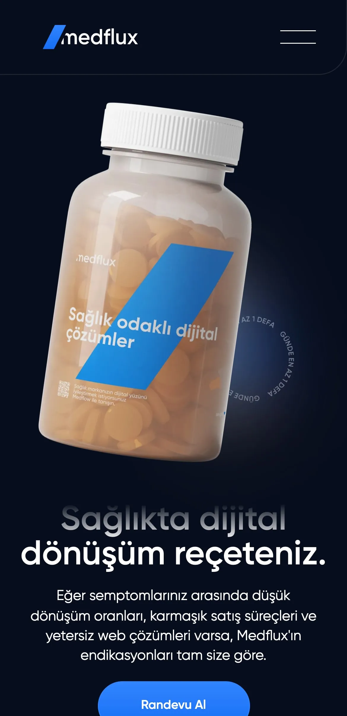
I carried the site’s medical metaphor (prescription, treatment, indication) into a calm, orderly interface. I did the design and the Webflow build.
RESULT
A complete agency site with five services in one menu, plus team, careers and blog pages.
What I did (05)
- 01Service menuFive services with short descriptions in a single dropdown.
- 02InterfaceLayout, typography and components; a UI-led design.
- 03Webflow buildThe design built one-to-one in Webflow.
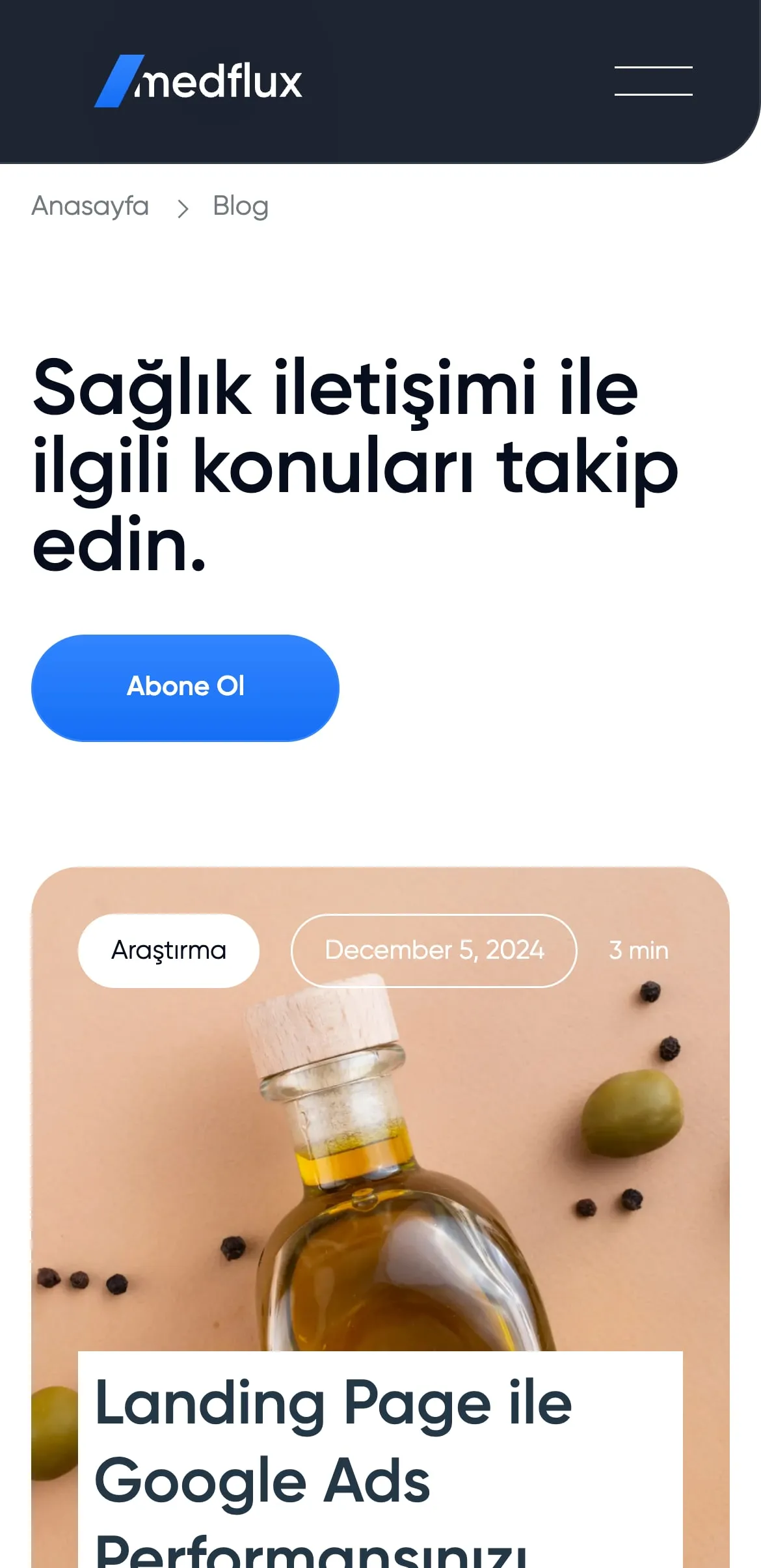
- 04Blog and newsletterArticles on healthcare communication and a newsletter sign-up.
- 05Team and careersThe agency’s team and open roles on their own pages.
In healthcare, trust
comes from calm.
On the phone
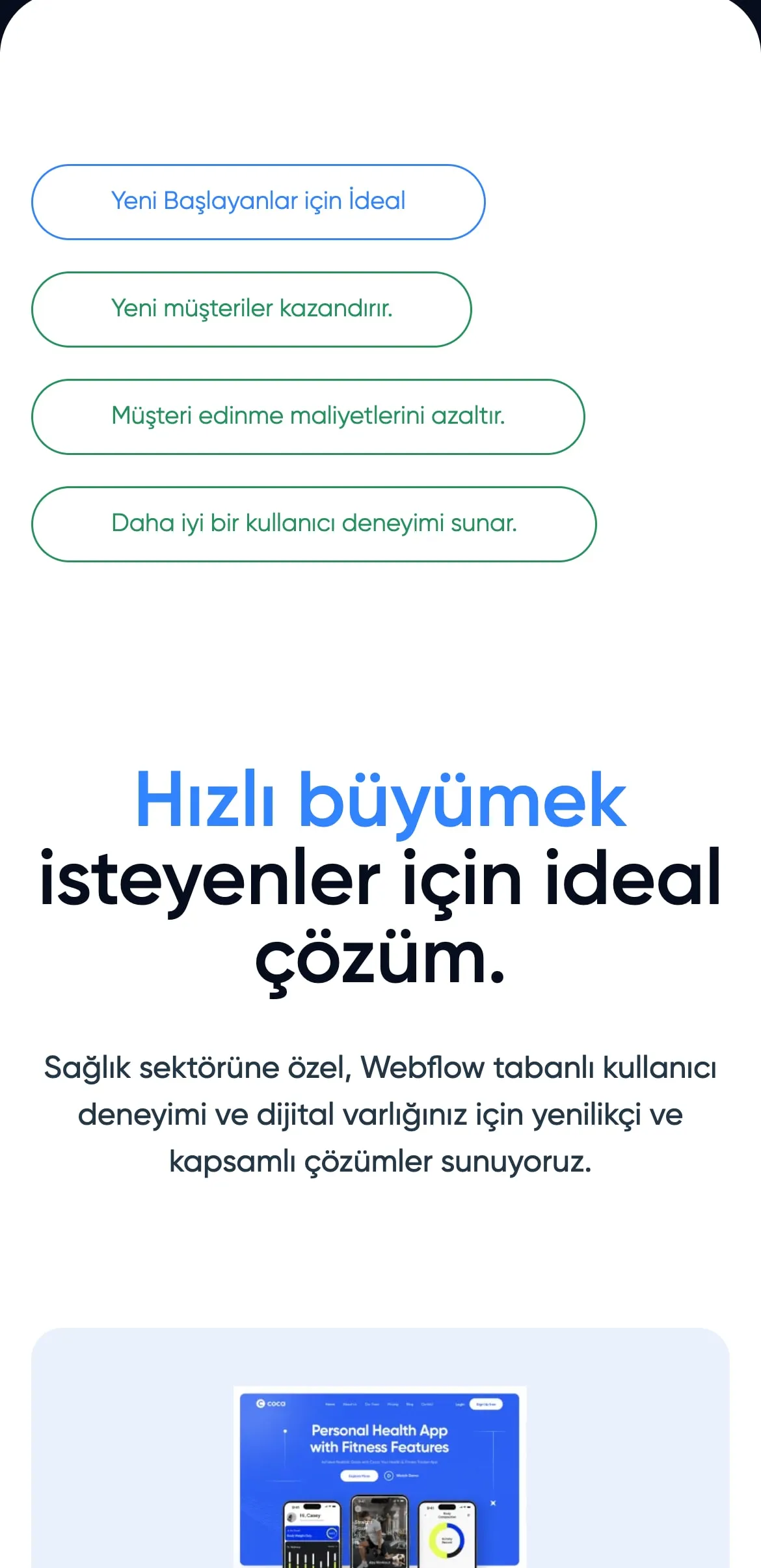
The interface was built to stay just as calm on every screen.
BRAND COLOURS
The site’s core colours.
NAVY#060D1C
BLUE#2076F9
BACKGROUND#FFFFFF